Below are 4 images (chosen from the several shots like them) that I used throughout the designing pf both my magazine front cover and my film poster.

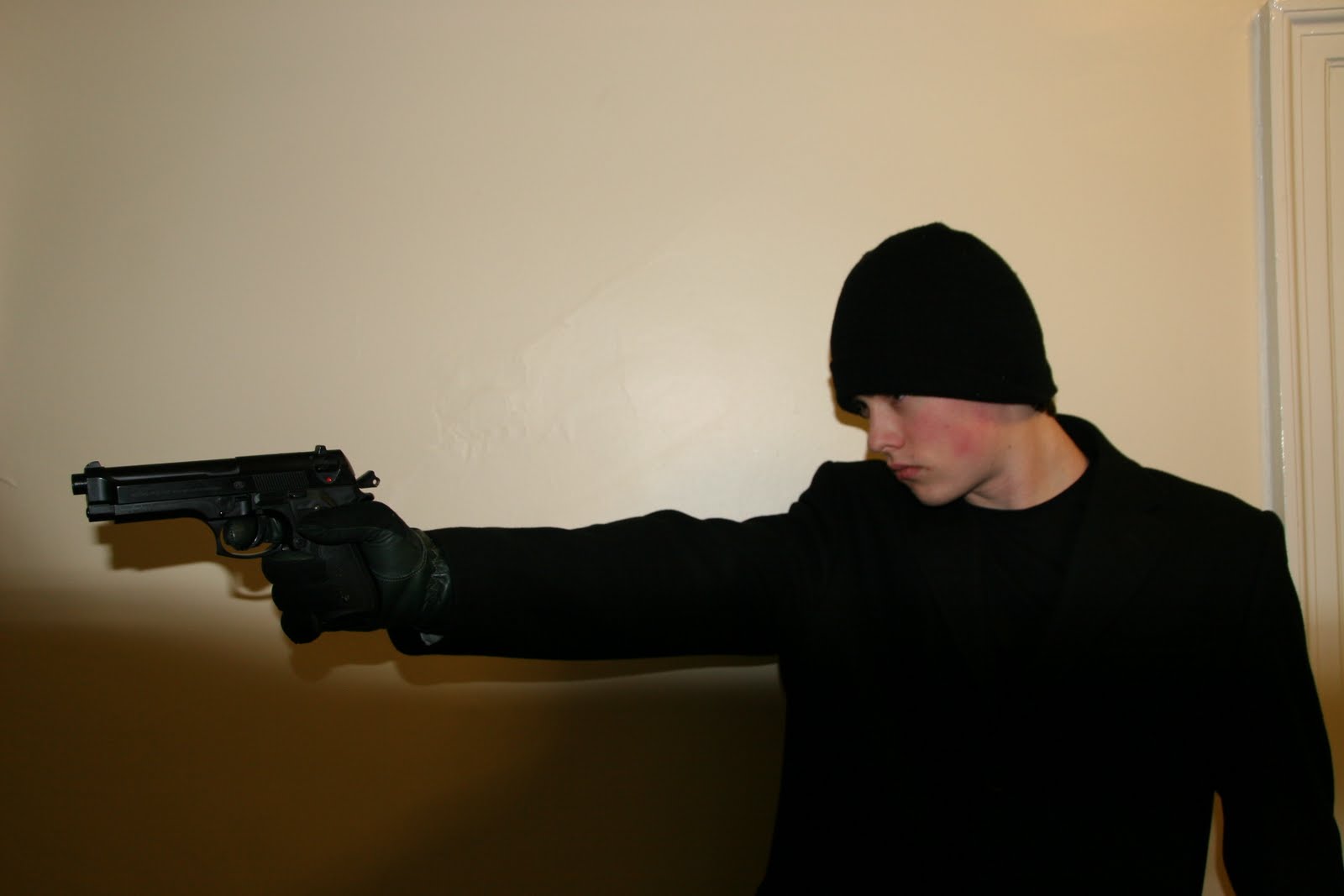
 Now you can see that these images were not taken in a proper studio. They were in fact taken on a whitish wall next to a bathroom. Unfortunately my actor wasn't available when the media studio was set up. It didn't matter though because I used Adobe photoshop to simple remove the background although this was very tedious.
I started off by design a rough outline of what it should look like and where everything would be roughly laid out. Planning is important because it allows you to be creative yet still meet the requirements (in this case meeting the norms for a film magazine front cover). Below is a copy of my rough designs for the front cover.
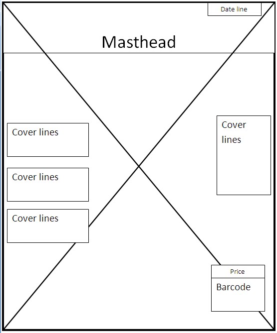 I will note that I had hand drawn a much more detailed version of my rough draft with all the measurements included. This would allow anyone to take my designs and reproduce them exactly, but I haven't included them here.
 I started off by creating a blank sheet A4 size sheet in Adobe Photoshop. I then transferred the photo of the FIXER looking down. I debated as to what to use as the title of my film magazine but I eventually choose 'Replay'.
I added the title 'Replay' as the masthead and used bevel and emboss to to give it a 3D effect to make the title stand out more. I added some drop shadow and colour red to further make it stand out.
I used an online line text graphics generator to create the broken/ fractured text to spell out the title 'The Fixer.' I split the title into two and placed each word either side of the main image.

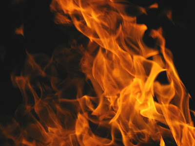
I then used a photo of flames and mounted it as a layer behind the main image and text. I warped a few areas of the fire using the clone stamp tool to drag some flames out longer and spread the fire in some areas a little more. I added a coverline in the form of a film preview for the upcoming film 'Priest.' I placed it in the bottom left third of the page so that it stuck out but did not cover to much of the main image.
 Next step was to add the selling line at the top right hand third of that page, "The UK no 1. Film Magazine."
I then added 3 more cover lines on the middle right hand third. I used a red line as a nice divider between each coverline. I made the header for the cover liner larger than the text underneath to make it standout more. Everything on a magazine cover should be designed so it maximizes the potential to grab someones attention and then draw them in effectively so that they pick up the magazine and read the contents page for example and ultimately possibly buy it.
I then added the bar code (I used a high resolution image off the Internet) and the price for the magazine which I set at a reasonable 3.oo pounds.
When I had finished my magazine front cover I asked my class and several other students at my school to comment and give me some feedback. A lot of people recommended that I should add some more cover lines and make the text a little bigger. My media teacher Mr. Breeze then pointed out something very interesting to me, he said, "In that photo shows him looking down. Have you ever seen a magazine cover where the person looks down? They always looking straight at you." The first thing I did was grab a bunch of EMPIRE and Total FILM magazine and go through re looking over loads of front covers and sure enough they are all looking straight at you.
As a result I changed the main image and added an extra coverline with picture at the bottom left hand third of the page. I then took all the coverlines and enlarged there size and put a black outer glow effect to make them standout more.
Acting on audience feedback I removed the original film title and change it to a much large Silver and Red combination and placed it at the bottom of the page as well as adding a main coverline about an interview underneath the title.

Once I had finished creating my final version of the Magazine front cover I asked ex St.Edmunds College media student Billy form to give me his thoughts on my magazine trailer, what worked for him, what didnt. Below is his video.
His feedback was very positive and from his reactions its clear that I have met the conventions for an action thriller based magazine front cover and that I have prehaps challenged them by having an action thriller that also has a much darker tone to it.
No comments:
Post a Comment