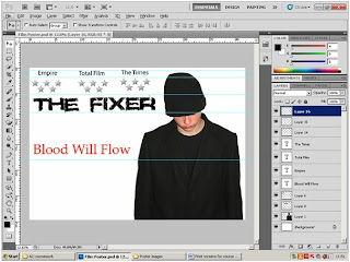
 I first added the main image and placed it on the A3 size canvas. I removed all the background from the image and slightly darkened section of the jacket so that it was was one colour all the way through, no shine or shadows.
I then added 3 critics. I choose the film magazines EMPIRE plus Total Film and the newspaper The Times. I got a high resolution image of a silver star off google. I then duplicated the start 5 times and laid it out in a group, I then merged all the layers together to create one layer. Once I finished merging the layers together I took the new layer and duplicated it twice. I then took one group of 5 stars and placed them under each Magazine and the one newspaper.
I then added the same fragmented/ destruction style title for The FIXER as I had used in my original Magazine front cover, and added the quote Blood will flow.
 I sat back and looked at my poster so far. Although you could say that the white background worked well, I wasn't really satisfied by it. So I decided to create a diffused looking background. Something like static. I started by using a grey layer and then adding a grain effect, I repeated the grain effect twice until I got what you see above. I thought for one made them image of the FIXER standout more and gave the connotation that very little its no about the situation this man is in. I t also gives that mysterious feel to it.
 I wasn't really pleased with the poster background so i scarped it and decided to go for an all black background. I also got rid of the destruction graphic and replaced it with the same font as my magazine front cover.
I then decide to change the titles for the two magazines and The times to a red colour and I added a red diffused outer glow to them to make them subtly stand out.
I considered how I could show a sense of action within my poster, so I decided to through in a high resolution picture (Got from internet) of a Colt .45 ACP. Problem was that it was to bright for the rest of the image and drew attention away from the main image of the FIXER. So I used the curve tool too evenly decrease the brightness of the gun so that it blended in with the background. You can see this change in the two images above.
 Once I finished creating this version of the poster I asked my CLass for feedback. They liked the overall layout of the poster but several people disliked the plain image of the gun. It didnt give a striaght and clear impression that its an action film. So working on their feedback I got rid of the image of the Colt .45ACP and change it to an image of the FIXER holding a Barreta 9mm and point at a slight angle.
I then added my company logo Panther Studious long with a 15 rating logo and the Dolby DIgitol Sound logo.
 My next step was to add the full list at the bottom of the poster. This included all the producers, publishers, directors, main actors, filming director, sound director, editing director etc. I also added the Dreamworks Logo.
I put two quotes under on of the magazines and The Times. I thought they were catchy lines prasing the film. I made the text white with a red outer diffuesed glow s they stood out really well. I also added a red outer difussed glow to the stars and I shortened the star ratings to 4 stars to be a little more realistic. I then hanged the colour of the main tite to White and Red to match both the magazine front cover and my teaser trailer.
Aboveis the final version of my film poster.
Once I had finished creating my final version of my film poster I asked ex St.Edmunds College media student Billy form to give me his thoughts on my film poster, what worked for him, what didnt. Below is his video.
No comments:
Post a Comment